Greetings Parents,
As we enter the final month of 2 dimensional art, I came up with a project that would show several of the media we have worked in and the types of paper used for them. For my younger classes, I read the book Red Sings from the Treetops: A Year in Color by Joyce Sidman. This book is wonderfully descriptive of all the colors of each season and how they change through each of the four seasons: Fall, Winter, Spring, and Summer.
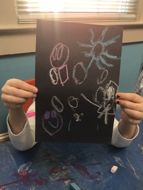
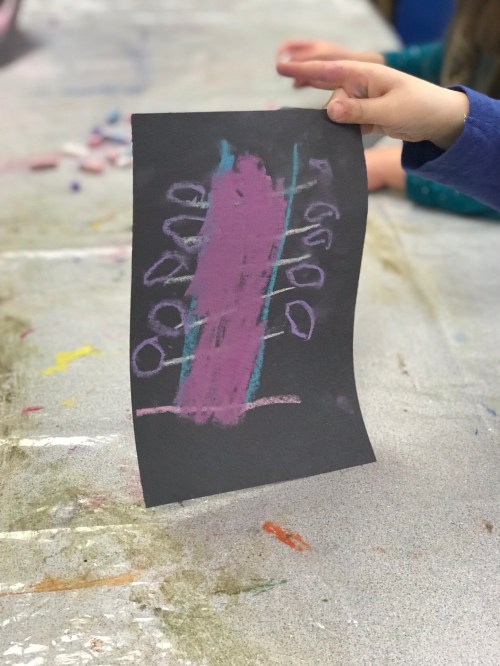
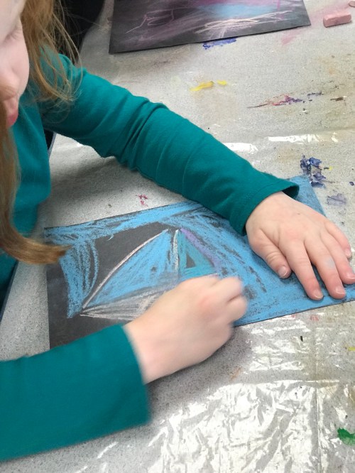
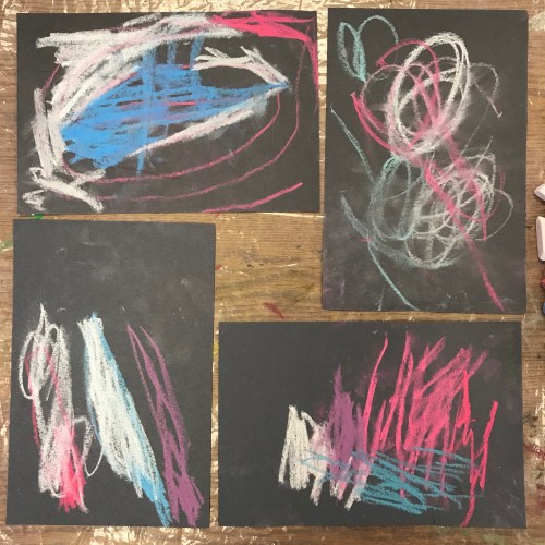
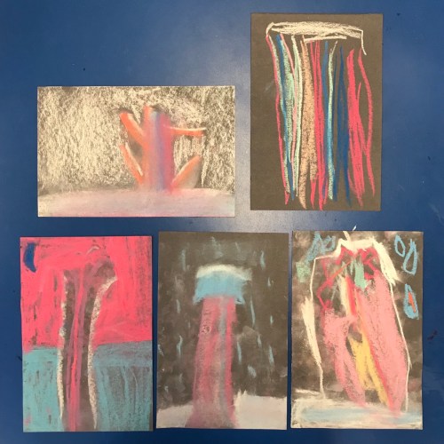
We started creating our tree images for Fall and Winter. The students could focus on realism for their trees, or work more abstractly and focus on the colors. Our fall pictures were created using red, yellow, orange, and brown colored pencils on sulphite paper. Sulphite paper is pretty versatile for dry and wet media, but works best with pencils, pastels, or charcoals. For our winter trees, we used white, pink, blue, and purple chalk pastels on black construction paper. Using a dark paper really makes the pastels pop off the paper and reflects the idea of long, dark winter nights with the contrast of snow on trees and the ground.
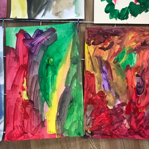
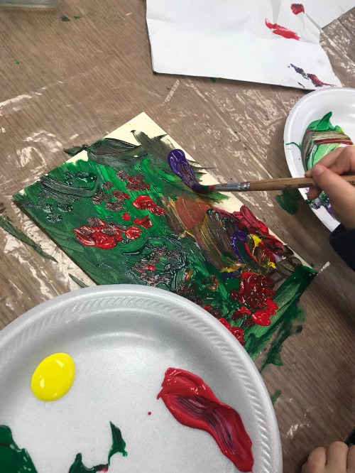
To start off the second class, I had the artists view a slideshow of most of the Haystacks painted by Claude Monet. Monet was the leader of the Impressionist movement where the focus of art moved from realism to using expressive color in paintings and sculpture. I explained how Monet would paint these haystacks over the four seasons in France, but would also paint them just in the morning or just at night. He would paint them in the rain and in the snow. Every time the colors that he used would be different and expressive of the time of day, weather, or season.
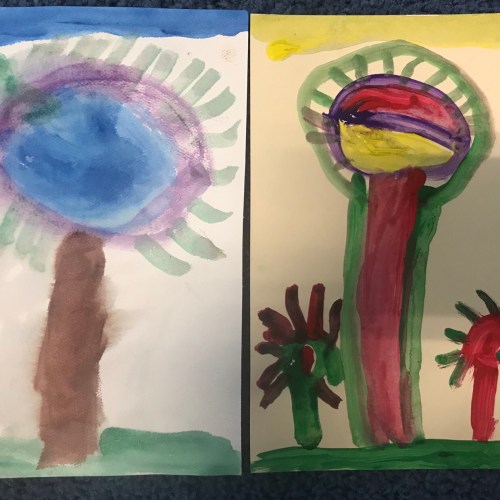
For Spring and Summer, we used paints to illustrate the change in seasons. For Spring, we used cold press paper and the technique we used is known as a watercolor wash. For a watercolor wash, the cold press paper is washed with water to make it damp before adding the watercolors. Cold press paper is designed to hold lots of water or wet media without ripping or tearing. By painting on wet paper, it creates a softer color with chances for them to blend together on the paper. I also chose the wash technique for spring because of all the spring showers that make our gardens grow. For summer, we used a manila hot press paper to paint using temperas. The colors for summer were yellow, purple, red, and green. With all of the seasons, the artists could blend and mix colors to create different colors or textures for their trees.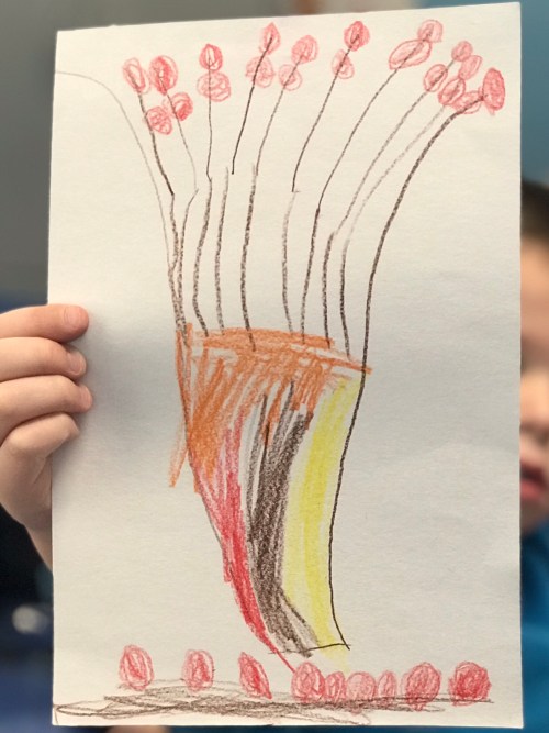


The objective of this lesson is to use sensory exploration of the environment as a source of imagery.
At this point in the year, we have finished working in 2 Dimension with drawings and paintings. From February to May, we will be working in 3 Dimensions in our Clay and Sculpture Session. I can’t wait to see how our artists begin to grow and build their art!

Leave a comment