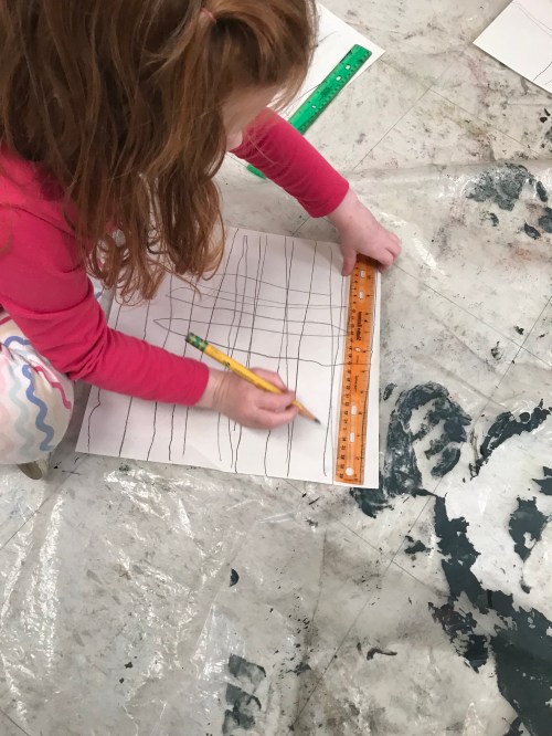
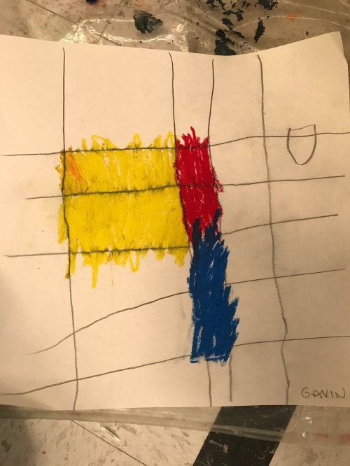
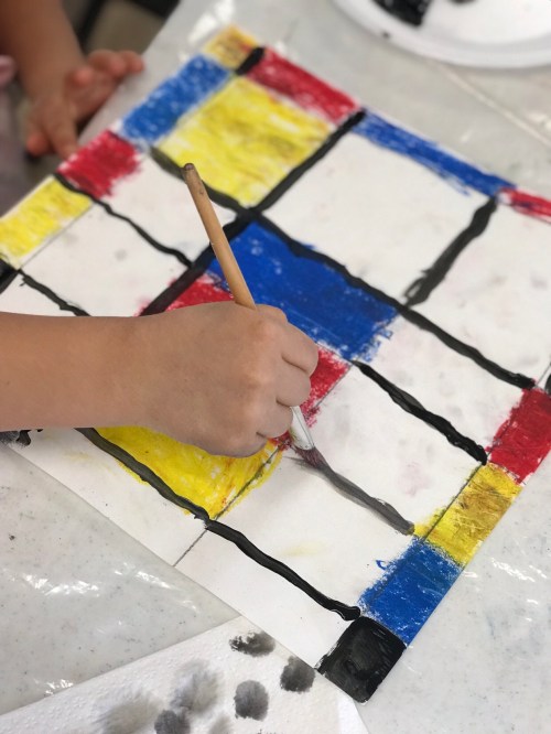
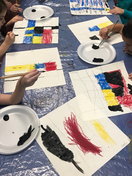
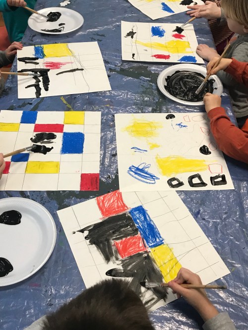
We started off our first class by watching a video of the song “Three Primary Colors” from Sesame Street. This song is very catchy and easy for the artists to remember the primary colors. It’s also a great introduction to what we will be exploring through this and our next project. Red, blue, and yellow are the Primary Colors. They are the colors that are used to mix every other color, except white or black (but that’s a whole other project…). I then took out a ruler and asked the class if they knew what it was used for. Many knew that a ruler is used for measuring but didn’t realize it can be used for drawing straight lines. I demonstrated how to hold a ruler and then requested that there be a minimum of 5 horizontal lines and 4 vertical lines. After lines were drawn, I passed out oil pastels in red, blue, and yellow. Again, I required a minimum number of squares/rectangles to color in (2 each for the younger students and 4 each for my older groups). I wanted each square/rectangle to be colored in completely, leaving most of the white paper hidden so that the bright, smooth texture of the oil pastel would show how different they are from other types of pastel.
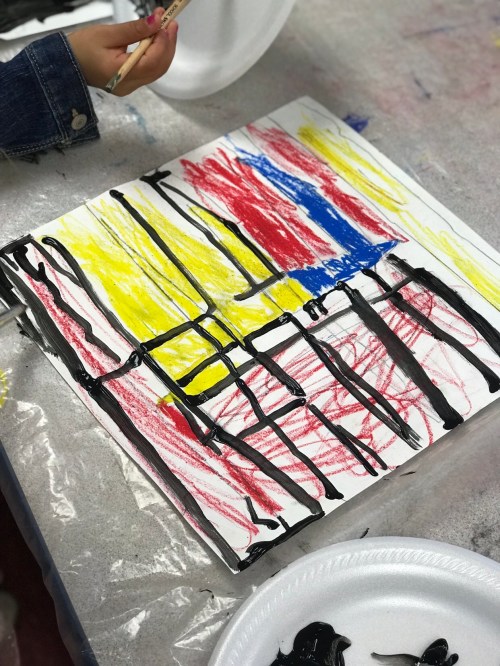
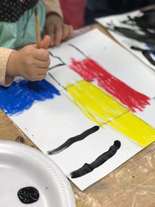
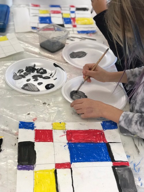
At the start of the second class, I introduced the artist Piet Mondrian. Mondrian was a Dutch artist who created art through simplicity. After moving to New York City and finding artistic inspiration from the bright lights of Broadway, he simplified his paintings with the use of color to just using red, blue, and yellow and grid-like horizontal and vertical lines to create a composition of squares and rectangles. We first focused on one of Mondrian’s paintings, Broadway Boogie Woogie (1944). He made this painting after traveling to New York City. The glow of electric Broadway lights and the constant movement of transportation were so inspiring to him that it led to this painting. I showed them a video “Lost in the City” by Pham Tung. It is an animation that is created from Mondrian’s painting. It’s in the viewpoint of someone who is lost within a world of moving colors. The students loved seeing a painting come to life in a medium that is very familiar to them. I gave them black tempera paint to add any additional squares/rectangles and to trace and redefine their horizontal and vertical lines. While they were working, I played boogie music from Pandora that would have been popular during Mondrian’s life. Some students liked the faster paced piano melodies, while some thought it “sounded strange” compared to what you hear on the radio today.
If there was extra time, we read the book White Rabbit’s Color Book by Alan Baker as a way to reinforce the primary colors, and as an introduction to the secondary colors for our next project.
The objective of this project was to use a variety of tools safely and appropriately to create art and to execute control of a variety of media.

Our next project will focus on the habitats of Pandas while exploring Secondary Colors.

Leave a comment